
Last updated November 2026
A web design glossary is a list of the common terms designers and developers use, explained in plain language. If you have ever read a proposal that mentioned wireframes, CMS platforms and responsive breakpoints and quietly nodded along, this guide is for you. We have kept it practical: each entry says what the term means and why a small business owner should care.
Knowing the vocabulary does more than help you follow a conversation. It helps you compare quotes, give specific feedback and notice when a proposal leaves out something important. Below are 24 terms you are most likely to meet when you plan, build or update a website.
What are the most common web design terms?
The most common web design terms are call to action, CMS, responsive design, wireframe, landing page, white space and page speed. They describe how a site looks, how it is built and how well it performs. Learn these seven first, then use the full list below as a reference.
1. Above the fold
The part of a page you can see without scrolling. The phrase comes from newspapers, where the top half of the front page was visible on the newsstand. On a website, it is where your main message and your main button should live, because a visitor who sees neither often leaves.
2. Hero section
The big banner at the very top of a page. It usually has a headline, one supporting sentence, a button and an image. A good hero tells a stranger what you do and who it is for in about five seconds.
3. Call to action (CTA)
A button or link that asks the visitor to do one specific thing, such as “Get a Quote” or “Call Now”. Pages with one clear call to action usually convert better than pages offering six different choices.
4. CMS (content management system)
Software that lets you edit your site through a simple dashboard instead of code. WordPress is the best known. If you plan to add blog posts or change prices yourself, ask any designer which CMS they will use. Our CMS development page explains the options.
5. Responsive design
A layout that rearranges itself to fit the screen it appears on. Columns stack on a phone, menus collapse into an icon, and images shrink. One responsive site replaces the old habit of building a separate mobile site.
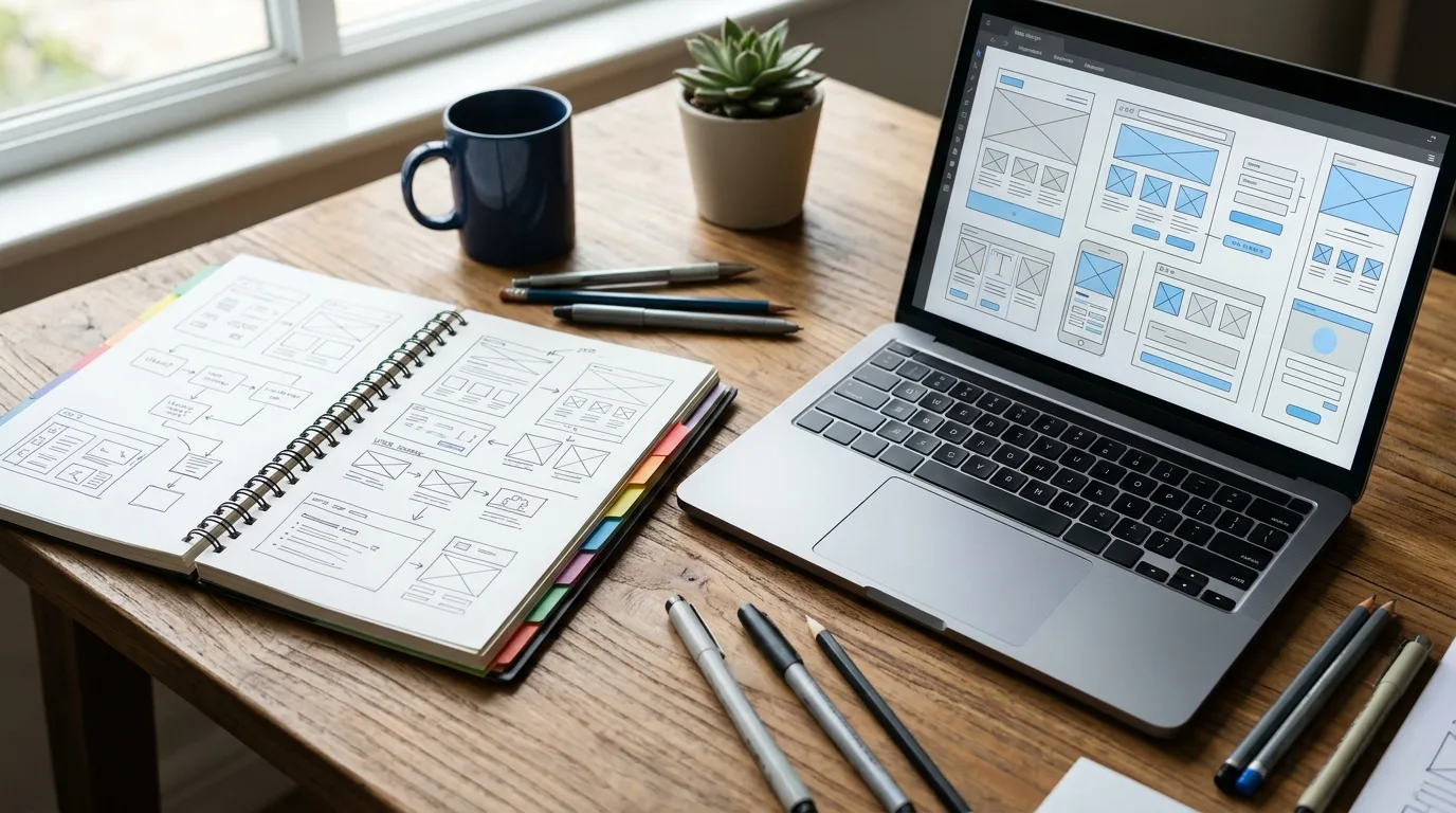
6. Wireframe
A rough black and white sketch of a page, made before any colors, fonts or photos. Wireframes let you argue about layout when changes cost minutes instead of days.
7. Mockup
A realistic picture of the finished page with real colors, fonts and images, but no working code. You approve the mockup before developers start building.
8. Storyboard
A sequence of screens or sketches that shows how a visitor moves through the site, from the first click to the contact form. It helps you spot dead ends before anything is built.
9. Modal
A box that appears on top of the page and dims everything behind it, often holding a sign-up form or a notice. Modals interrupt people, so use them rarely and make them easy to close.
10. Lightbox
A type of modal that opens a larger version of an image or video. Photo galleries on portfolio sites use it.
11. Navigation menu
The set of links that helps visitors move around your site. Keep it short. Five to seven top-level items is a sensible limit for most small business sites.
12. Breadcrumbs
A small trail of links such as Home, Services, Web Design that shows where you are on the site and lets you step back one level. They help both visitors and search engines understand your structure.
13. Footer
The strip at the bottom of every page. It usually carries contact details, your address, legal links and a handful of important pages. Many people scroll straight to the footer to find a phone number.
14. Typography
The choice of fonts, sizes, line spacing and weights used for text. Most readable sites use two fonts at most and keep body text comfortably large.
15. White space
The empty area around text and images. It is also called negative space. It is not wasted room. Crowded pages feel cheap, and generous spacing makes the same content look more expensive.
16. Favicon
The tiny icon next to your page title in a browser tab and in bookmarks. It is a small detail, but a missing favicon makes a site look unfinished.
17. Landing page
A single page built for one goal, such as collecting leads from an ad. It usually drops the main menu so visitors have fewer ways to wander off. Our landing page design service is built around this idea.
18. Bounce rate
The share of visitors who leave after viewing a single page without doing anything. A high bounce rate is not always bad (a page that answers a phone number question quickly may be doing its job), but on a service page it usually signals a mismatch.
19. Page speed
How quickly a page loads and becomes usable. Google measures it with Core Web Vitals, including a loading target of 2.5 seconds or less for the largest element on screen.
20. Alt text
A short written description of an image, read aloud by screen readers and used by search engines. Describe what the image shows in plain words, and skip phrases like “image of”.
21. SSL certificate
The security layer that turns http into https and shows a padlock in the address bar. Browsers warn visitors away from sites without it, so it is no longer optional.
22. Domain name
Your web address, such as yourbusiness.com. You rent it yearly from a registrar. Make sure it is registered in your name, not your designer’s.
23. Hosting
The computer where your website files live so the public can reach them. Cheap shared hosting can slow a site down, which matters more than most owners expect.
24. Plugin
An add-on that gives a CMS extra abilities, such as contact forms or booking calendars. Each plugin is also something that needs updating, so install only what you really use.
25. Above-the-fold test
A quick check you can run yourself: open your homepage on a phone and see whether a stranger could tell what you sell and how to reach you without scrolling. If not, that is your first fix.
How do these terms show up in a real project?
Here is a typical example. A café owner asks for a new site. The designer sends wireframes of three pages, then a mockup of the homepage with the real logo and colors. After approval, developers build it on a CMS, test it on phones, add alt text to the photos and run a speed check before launch. Every step in that sentence is a term from this list.
When you know the words, you can ask sharper questions. “Will the menu collapse on phones?” gets a better answer than “Will it work on mobile?” and “Who owns the domain?” protects you from a surprise years later.
Why does web design vocabulary matter for small businesses?
Vocabulary matters because vague briefs create expensive revisions. When you can point at the hero section and say the call to action is too small, a designer fixes it in minutes. When you say “it feels off”, you may pay for three rounds of guesses. Clear language also makes it easier to spot proposals that skip basics such as SSL, alt text or a CMS.
It also helps you evaluate promises. A company that guarantees a “top-ranking responsive site” should be able to explain what responsive means and how they test it. If the answer is fuzzy, that is information too.
Which terms should you learn first?
| Term | Why it matters first |
|---|---|
| Call to action | Decides whether visitors contact you |
| CMS | Decides whether you can edit your own site |
| Responsive design | Most visitors arrive on a phone. Roughly 63 percent of global web traffic came from mobile devices in 2025, according to figures compiled by DesignRush |
| Page speed | Affects both visitors and search visibility |
| Domain and hosting | Decide who really controls your site |
If you only have ten minutes before a call with a designer, read those five rows and the entries for wireframe and landing page. That covers most of what comes up in a first meeting.
Where can you see these ideas in action?
Browse the live examples on our business website design page and try spotting each term: the hero section, the call to action, the navigation menu, the footer. Then open the same page on your phone and watch the responsive layout rearrange itself. Ten minutes of looking will teach you more than a dozen definitions.
Related reading
- Web Design for Small Business: A No-Jargon Starter Guide
- Why Web Design Matters More Than You Think for Small Businesses
- What Is the Best Website Builder for Small Business? Our Honest Take
- What Is Accessibility in Web Design (and Why It’s Not Optional)
Frequently asked questions
What is the difference between a wireframe and a mockup?
A wireframe is a plain sketch that shows where things go. A mockup is a realistic picture of the finished page with colors, fonts and images. Wireframes settle layout, and mockups settle the look.
What does CMS stand for?
CMS stands for content management system. It is software, such as WordPress, that lets you edit pages, add blog posts and update images without writing code.
What does responsive mean in web design?
Responsive means the page layout adjusts automatically to the size of the screen, so the same site works on a phone, a tablet and a desktop computer.
What is above the fold on a website?
Above the fold is the part of a page visible before you scroll. It should carry your main message and your main call to action.
Do I need to learn all of these terms?
No. Start with call to action, CMS, responsive design, wireframe and page speed. The rest you can look up when they come up.
Sources
Planning a new site and want a partner who explains things in plain English? Request a free quote and we will walk you through every step.